-
Network Of Indian Cultural EnterprisesNetwork Of Indian Cultural Enterprises
-
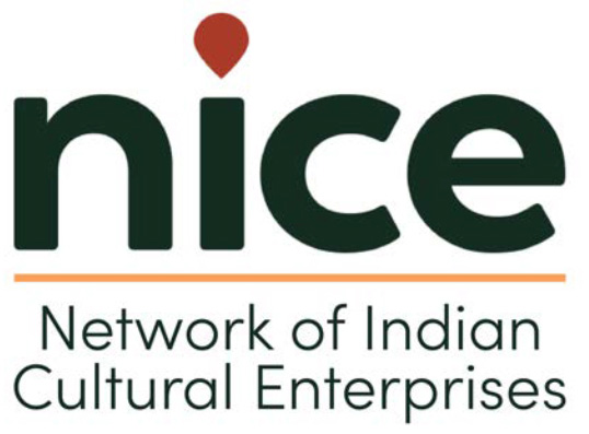
LogoLogo
-
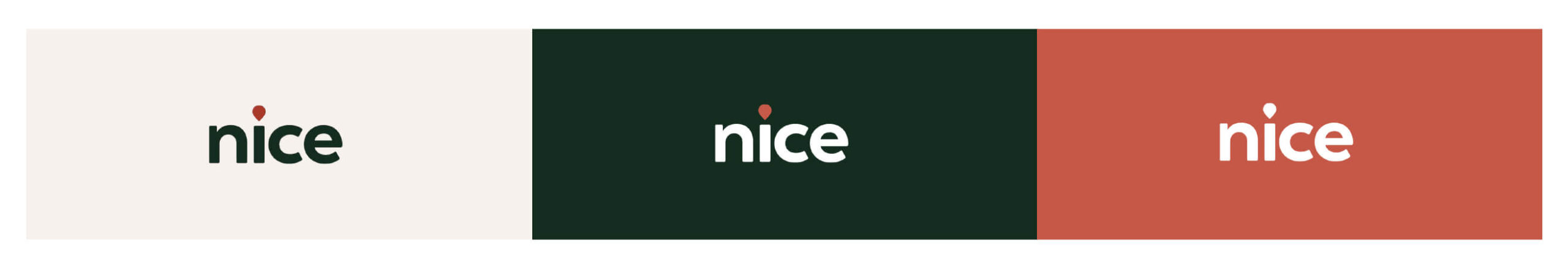
ColorsColors
-
TyopographyTyopography
-
Visual ElementsVisual Elements
-
Visual ImaginaryVisual Imaginary
-
Branding KitBranding Kit
Network Of Indian Cultural Enterprises (NICEorg)
Brand Guidelines
Network of Indian Cultural Enterprises, abbreviated as NICEorg, is a Section 8, Not-for-Profit organization that started operations in October 2020.
NICEorg is engaged in promoting, programing and enabling workshops, networking, mentoring, funding, research, and policy advocacy for entrepreneurs building Indian cultural enterprises across five NICE Sectors.
Cultural Enterprises across Five NICE Sectors. NICEorg conducts various programmes such as NICE Aarohana, NICE Mantrana, NICE Samvaad and NICE Angels Meet among others. NICEorg aims to build Brand India by enabling the creation of successful cultural enterprises.
Logo
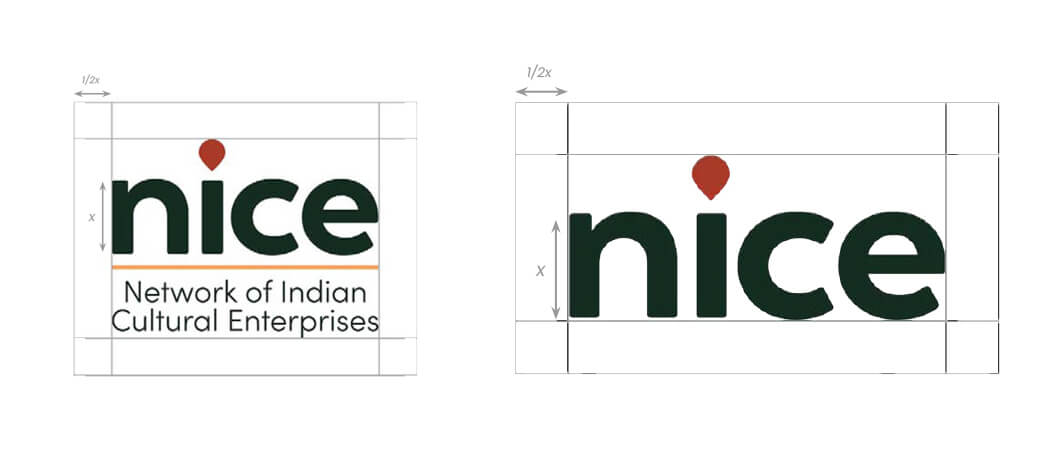
The NICE logo is a combination of the word ‘nice’ with the single saffron-colored kolam drop as the dot for ‘i’. The typeface used is Sofia Pro.
The main colors used are:
-
Green | Hex: #152D20
-
Saffron | Hex: #A93A29
Usage
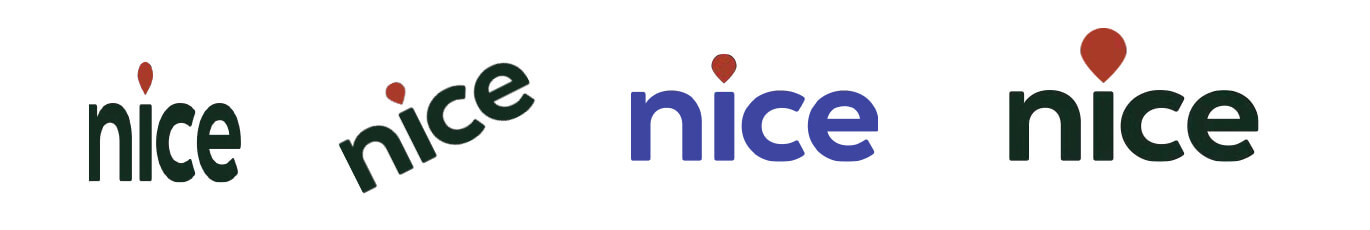
The NICE logo is meant to be used against lighter backgrounds in order to maintain legibility.
In the case of green background, the logo is to be used in white with the kolam drop becoming light saffron.
In the case of any other dark background color, the logo is to be used in white.
Tagline
The NICE extended logo has the full form of NICEorg (Network of Indian Cultural Enterprises) written below it. The typeface used is Sofia Pro.
A divider distincts the logo from the organization’s name. The divider is in the color #FC9E58. In case of using this logo on a dark background, the logo should appear on a small light colored patch.
This version of the logo is to be used for featuring NICEorg in events, promotions or any other content generated by a NICE partner or a third party.
Spacing
The NICE logo and extended logo must have breathing room of at least 1/2x, where x is the height of the ‘n’ letter.
Restrictions
The NICE logo should not be stretched unproportionately or tilted. The kolam drop should not be altered in any way.
The colors must not be changed, unless in the case of using against a dark background.
Prior approval from authorities at NICEorg must be obtained before the altered version of NICE logo is used by an associated organization
Nice Aarohana
Aarohana, in Sanskrit, refers to ascend or a path of onwards growth. The logo is an extension of the main NICE Logo, with the word “aarohana” written in lowercase, and followed by three petals depicting upward direction.
Logo Attributes:
-
Colors: #152D20, #A93A29, #C65945
-
Ratio: 2.89:1
-
To be used against cream-white and off-white colors
Nice Mantrana
Mantrana, in Sanskrit, refers to advice and is therefore apt for the mentorship activities of NICE. The shape is constructed using the elements of the petal kolam and depicts discussion and mentorship.
Logo Attributes:
-
Colors:
-
Text : #152d20 #A93A29
-
Icon : #A93A29, #FCBB45 #75AAFA #B2A349 #c65948
-
Ratio: 3.2:1
-
To be used against cream-white and off-white colors
Nice Samvaad
Samvaad, in Sanskrit, refers to conversations. Hence, the two ‘a’ in the word samvaad have been replaced with the drop graphic, signifying two speech bubbles to denote conversation.
Logo Attributes:
-
Colors: #E1A551, #A93A29, #152D20
-
Ratio: 2.7:1
-
To be used against cream-white and off-white colors
NICE Angels Meet
Logo Attributes:
-
Colors: #A93A29, #FCBB45, #B2A349, #c65948
-
Ratio: 2.7:1
-
To be used against cream-white and off-white colors
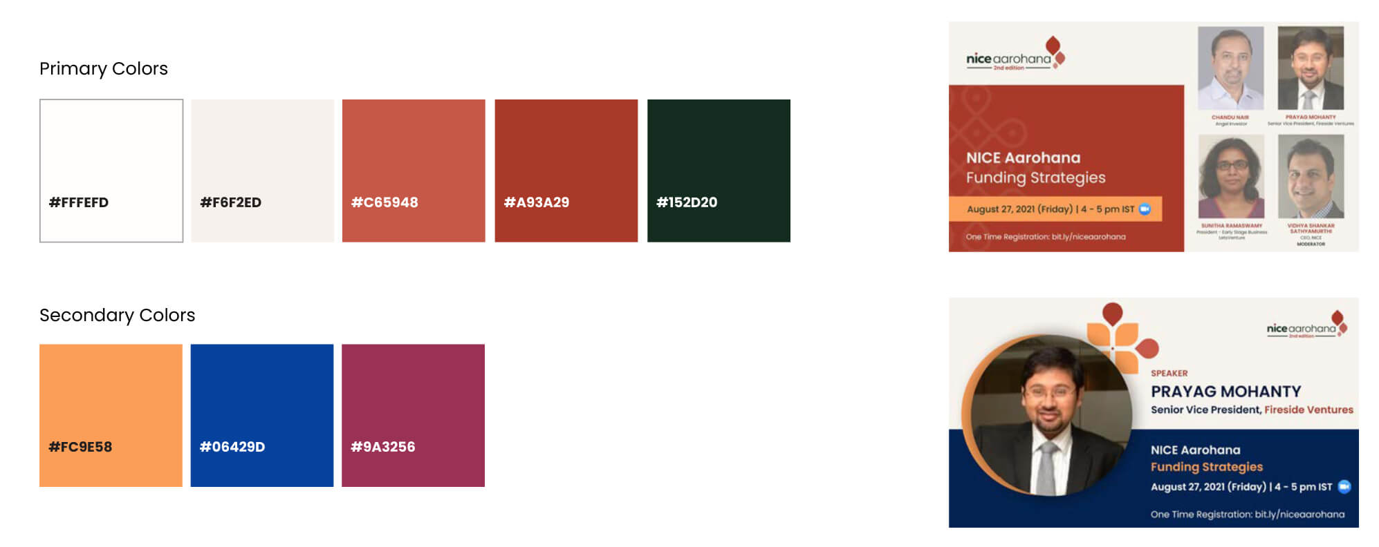
Colors
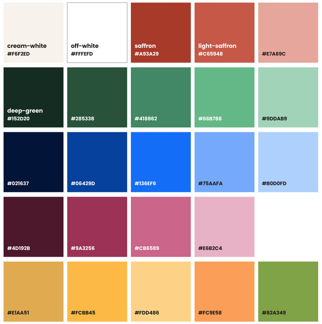
Primary Palette
The NICE palette includes timeless, vibrant Indian colors- shades of indigo and velvet along with kesar, yellow, gold and green.
The primary palette includes bold colors of red and dark green along with neutral shades of cream and white.
This palette is particularly used as the base shades for any creative content including the website and email.
The NICE logo and program logos are designed using the primary colors
Extended Palette
The NICE extended palette includes timeless, vibrant Indian colors- shades of indigo and velvet along with kesar, yellow, gold and green.
All the NICEorg collaterals and creatives employ one or a combination of these shades.
Tyopography
Poppins
Fira Sans
Visual Elements
Graphics
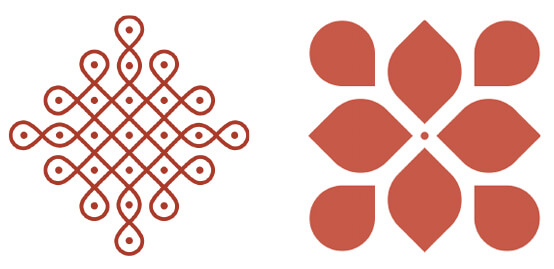
Kolam, the centuries-old practice of drawing beautiful patterns in households, has been the inspiration for NICEorg’s brand language.
The art begins by a single dot and is extended to a beautiful design of intricate networks. Kolam is symbolic of Indian heritage and also indicative of a network-based approach to creation. This resonates with the mission of NICEorg –– to build a well-networked and continuously growing ecosystem of cultural entrepreneurs, investors and industry experts –– for strengthening Brand India.
Graphics
Two main graphic elements that are used in social media creatives is the line kolam and the petal kolam.
These can be used a background watermark or as solid graphics. The petal kolam can be used to create seamless patterns or be deconstructed to use individual petals. Both these elements can be used in any of the brand colors.
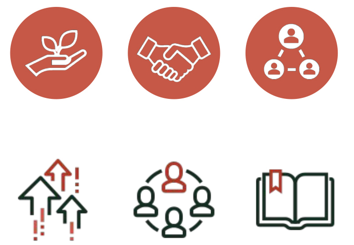
Icons
Icons can be used to visually depict abstract concepts in a concise manner. They can be used in the website, presentations and on social media, when appropriate. They may be used in an outline or a solid fill, to give variety. All must adhere to the NICE colors.
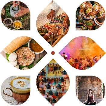
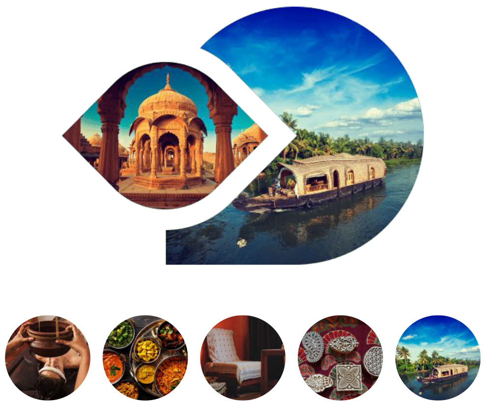
Visual Imaginary
Photography - Focus Sectors
-
Health, Beauty and Wellness
-
Food and Beverages
-
Home Decor and Furnishings
-
Fashion and Accessories
-
Experiential Tourism
Photography - Social Media / Sessions
All programs use pictures to denote the theme of the event. Images of speakers are used in session flyers, speaker flyers or any other instance of mention of the speaker. This is combined with respective NICE program logo and visual elements wherever needed.
Social media dimensions are as follows:
-
Instagram Post: 1350 x 1350 px
-
Instagram Story: 1080 x 1920
-
Facebook/LinkedIn/Twitter: 1600 x 900 (16:9 aspect ratio)

Nice Aarohana
NICE Aarohana creatives consist of speaker and session flyers. Session flyers are made in saffron color. Speaker flyers are made with using the colors in the extended palette. Both use the kesar to highlight information.
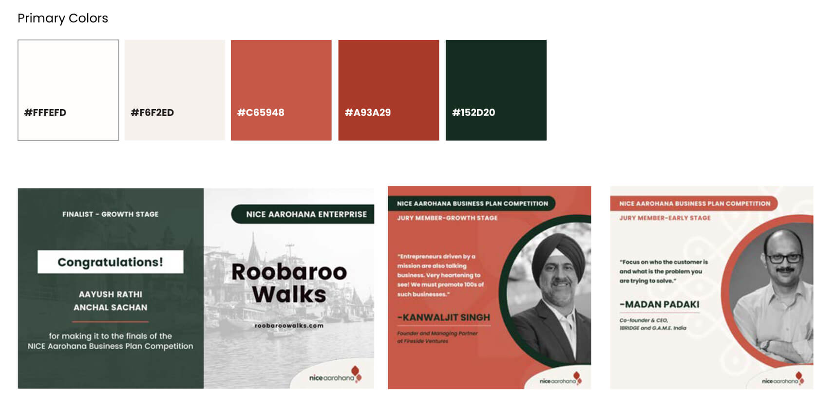
Nice Aarohana Business Plan Competition
NICE Aarohana Business Plan Competition creatives consist of an event image used in general announcement posts and on the website. The colors used are from the primary color palette.
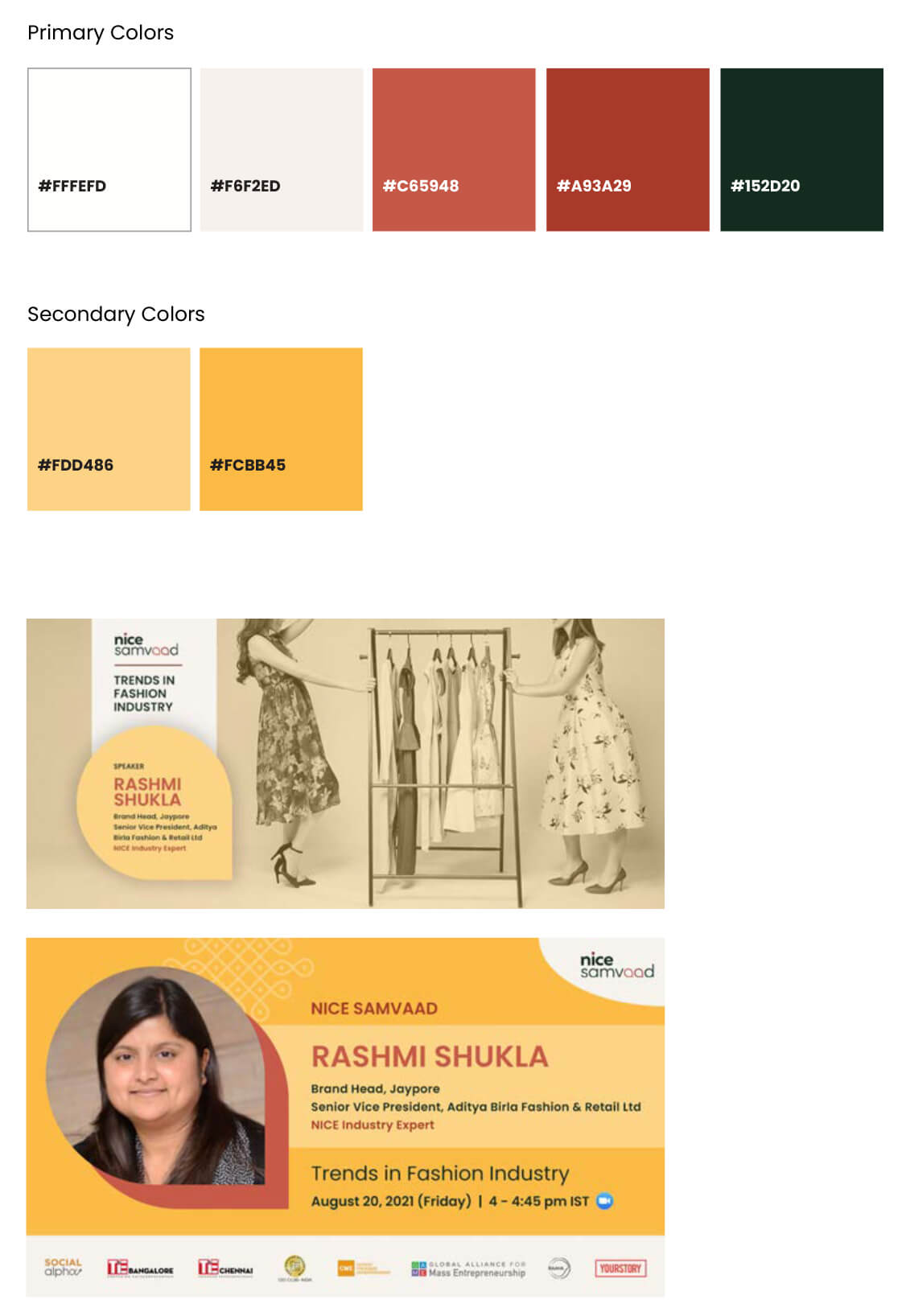
Nice Samvaad
NICE Samvaad uses yellow as the main color, supplemented by the primary color palette. The calendar image is to be made black and white with a yellow tint. The drop element used in the Samvaad logo can be incorporated wherever appropriate to reinforce Samvaad’s visual style.
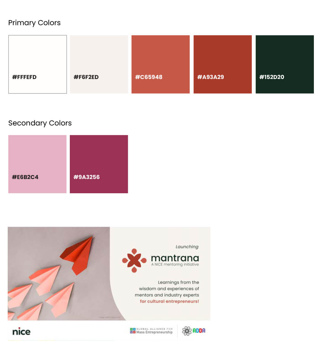
Nice Mantrana
NICE Mantrana creatives use colors from the primary color palette as well as shades of purple.
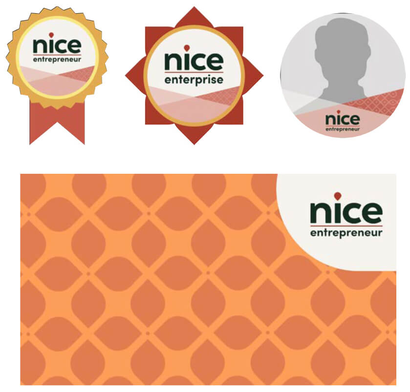
Branding Kit
Nice Entrepreneurs & Enterprises
Badges, profile picture frames and zoom backgrounds have been created for use by NICE entrepreneurs and NICE enterprises. All employ graphic elements and colors of NICE.