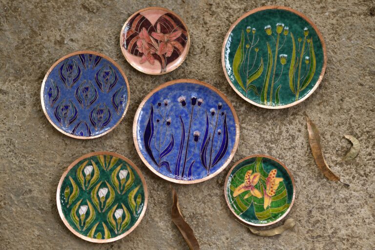
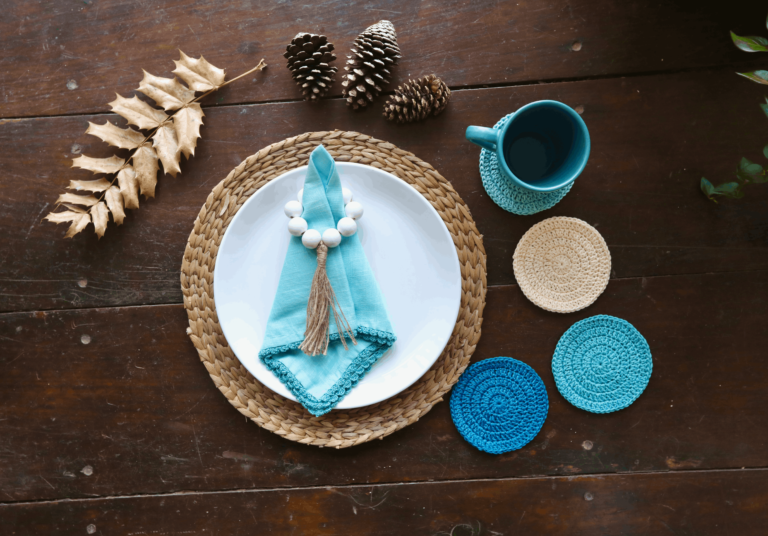
Ishan Khosla has been trying to create a bridge between the minimalistic design aesthetic being taught in design schools in India today, focusing on functionality, rationality and simplicity as understood in the West, and the rich ornate traditions of Indian art and craft.
He believes that it is time to “rethink what Indian design and type design should be about and take inspiration from. It is also time to re-evaluate the outmoded precepts of design that are blindly being followed in the country in favour of a sensibility that is sensitized to the way we Indians behave, dress, travel, create and live.”
He launched the Typecraft Initiative in 2012, “with the aim to unite type design, livelihood creation and the preservation of Indian crafts and tribal arts. The latter tend to be highly ornamental in nature. But rather than suppress this, we have embraced this aspect in the creation of the digital typefaces. Care has also been taken to ensure the typefaces remain functional as display typefaces, while being true to the original art-form.” Their customers are from across the world including Chile to New Zealand and from Australia to Canada.
In this interview, Ishan Khosla talks about his journey and the development of a new and creative visual language which is synchronous with the art it speaks about.
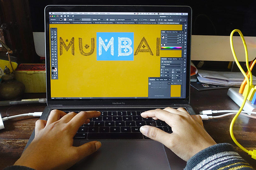
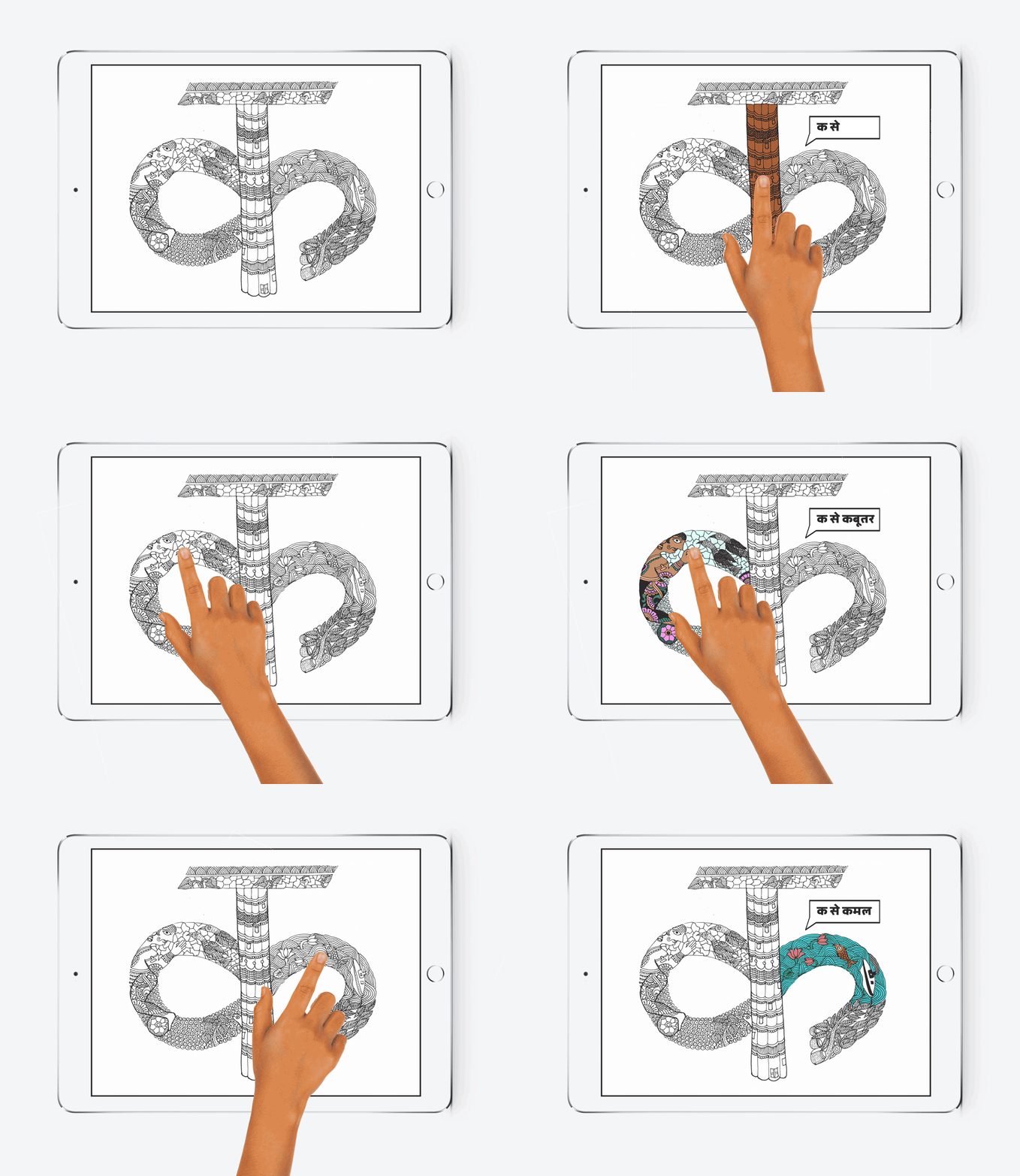
An example of Typecraft at work in its avatar as a digital typeface
Where did you grow up? Where did you pick up your impressions about India that you portray now?
I was born in Cochin, and lived there and in Bombay for a short while. My father was in the Navy so we would get transferred often, but he retired a few years after the transfer to Delhi. So I lived most of my childhood there.
I think I owe my Indian sensibility to both my parents. My father and I would visit local mandis and bazaars every weekend — as he would do the weekly grocery shopping of fish, fruits and veggies. It was in one of these mandis I once got lost, but apart from that traumatic experience I found them fascinating — the quality of light, as most of them were shaded with lights hanging from long wires. The myriad smells of meat and fish then suddenly a whiff of a mango; the dirt, and the crowds all felt very familiar. A lot of the work I do is related to the informal economy and I wonder if my fascination with the street vendors are related to this childhood experience.
With my mother I would travel on train across the country to Bhopal, Gwalior, Ahmedabad, Bombay, Shekhawati among other places — as she would go to these places as part of her work in advertising and corporate communications. Travelling still remains a very important part of my interest as a designer and socio-cultural inquisitor.
I think my love of the quotidien India was fostered by being away from home for so many years. First, being a foreigner in a foreign land and then also the similar feeling on my return, after being away over a decade. In a way, my experiences make me “not quite Indian” — and I think this in-betweenness or sameness-otherness, helps me see things differently.
What did your education in New York teach you about design?
I can’t pin down what my education taught me about design per se, but for sure my experience of temporarily losing my eye-sight when I was in my early 20s — prior to my education in New York — had a huge impact on how much I valued (and continue to value) the visual world.
While I learnt how to “see” — literally and metaphorically — after my recovery from surgery, perhaps School of Visual Arts and the NY ambience taught me how to “perceive” things in different ways. New York definitely gave me a fair deal of exposure to the zeitgeist and conceptual ways of thinking and to push boundaries in creative expressions.
I also got valuable lessons from the hard edged and cut-throat side of fast-paced city life from New York and perhaps that made me appreciate the opposite — which is what still attracts me to village India to work on craft-design projects.
How and when did you get the idea about the Typecraft Initiative? What is your main aim?
The earliest memory I have of working with crafts and art forms in the guise of a letter is in 2004 when I was working on my Master’s thesis. Design School India or DeSI is a hypothetical d-school in which I used in order to create a new manifesto for design education in India that would be based on social and cultural values from Indian villages — including craft — as an essential (though not exclusive) part of “design in the Indian context”. At that time, I wanted to as part of the branding of the school use elements from Indian culture — beyond the kitsch of truck art and Bollywood — to look at something with a more meaningful connection to the essence of Indian culture. Nothing came closer to me than Indian food and crafts. And so, as a student I made lettering from jalebi, “south Indian food” and leheriya saafas.
Fast forward to 2011, at which time as part of my studio (Ishan Khosla Design) in Delhi, I was working on several book covers and posters that included the use of type from Indian street culture, attire (The Accidental Godman) and also crafts or art forms like mehndi (Skin Ink).
Then, I also got an opportunity to create a brand for an Australian event that would span three years and include a discourse on craft, design and the user via conferences, talks, and exhibitions. I named the event “Sangam” the confluence of the three holy rivers — symbolizing — a confluence of designers, craftspersons and the user. As part of the branding, I decided to take a risk and work collaboratively with a craftsperson (rather than work in the silo of a design studio). I felt the risk of travelling to Kutch to try to make the identity was itself an interesting story, as the brand was really about celebrating this “coming together” craftsperson and designer. I worked with Sajnu ben, a Dhebaria Rabari craftswoman to work on the identity.
However, once the project was completed, I longed for a more prolonged interaction — not only because I enjoyed working with craftspeople in the village setting, but I also believed that just as design could benefit from its interaction with craft; craftspeople could also benefit from collaborations with designers. Furthermore, my sense in 2011 was that despite India’s rich visual arts — both historical and contemporary — there was nothing Indian about graphic design.
The Typecraft Initiative — started out as a challenge to both — crafts and (communication) design — to see whether one could really create a symbiosis of the best of what both could offer — in the form of a functional tool, a typeface. A typeface is a very powerful tool that is the starting point of more creation by the person using it — it is not an “end” unlike a t-shirt or mug but it becomes a “living and ever-changing” embodiment of the craft. An avatar if you will.
Additionally, I hoped that by creating this tool — we could entice people not familiar with a craft or a craft community to engage with them through the typeface, or by meeting and working with craftspeople directly. I wish to raise the bar of not just craft but also of design — and also for people to realize the beauty and potential of both. And perhaps, also to get the satisfaction that people are using the fonts we collectively create, to create art or even just to say “I love you” in a very cool and beautiful way.
When I started The Typecraft Initiative, I saw it from the end product point of view, but now I find the process and the learnings for designers, students and craftspeople invaluable. The use of type is not just valid from an end point of view as a functional tool — but by being decontextualized from the motifs and patterns the craftspeople are used to working with, the process of making letters becomes that much more challenging but also educational.
And then there’s the aspect of literacy, which is something that I am very keen to work on using the typefaces we have developed.
You have mapped craft and art clusters in India, how are you working in creating a type branding for them?
We have mapped out the craftspersons and communities we have worked with and wish to work with, but our mapping is not a detailed academic study of any kind.
We take our working methodology very seriously and our workshops with craftspeople are intensive with an emphasis on two-way learning. We learn from the craftspeople about their community, the crafts, how they are made, what their significance is, how the crafts and their value is changing, making it difficult for many to continue to work in the craft. These are all aspects we document diligently in our report document.
It is true that the typefaces we create are in a sense a type of branding for a craft or folk art community — as it is based on markings that define their identity if not to them, to outsiders who use the typefaces. There’s a big difference between a brand identity and a typeface. While both a logo (which is a part of a brand identity) and a typeface made from a craft can define its own identity — the former is very static and fixed in terms that it is more “top down” as something that is “applied” onto posters, websites and other communication.
However, a typeface is anything but that. Firstly, it is a tool — a starting point for more creativity — anyone, anywhere in the world can use a Typecraft font and make art, create a graphical communication, for instance, a “hello” in the Rabari typeface. Secondly, font is far more impactful and interactive than a brand can ever be. And thirdly, a typeface based on a craft can be used by the craftspeople themselves and others to become literate. It is then a very powerful tool for engendering positive change. The Typecraft font which consists of the DNA of the craft is then also its brand identity but much more.
Our process is quite detailed and nuanced over the years. Each of our Design Methodology Workshops have to be tailor made as per the craft, the material and the experience and exposure of the craftspeople we work with. The latter is hard to gauge before we start, and so improvisation is important — as is taking a step back every now and then — to see if things are moving in the right direction or are people just making and not learning. Or what is being made is not going to be useful from a type design perspective — aesthetically, technically or even legibility wise.
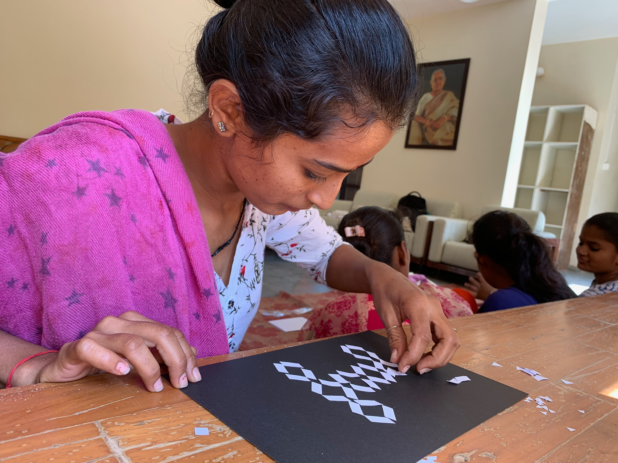
We usually start with simple materials and tools like paper and scissors and go from abstract or known motifs and designs to type and letterforms.
What has been the impact and reception for this initiative?
The goal since the beginning has been to use font design as a starting point to make a difference. Not just a difference to the crafts communities but also to highlight how crafts and design together can be a force for positive change.
While we have had made short-term impact to the livelihood of craftspersons — such the godharin tattoo artists of Chattisgarh that worked with us to create the Godna typeface — it is hard to gauge what the long-term impact of Typecraft has been in terms of not just livelihood but in also in terms of a change in perspective of how craftspeople look at their own work and how open they are to explore new forms and mediums going forward.
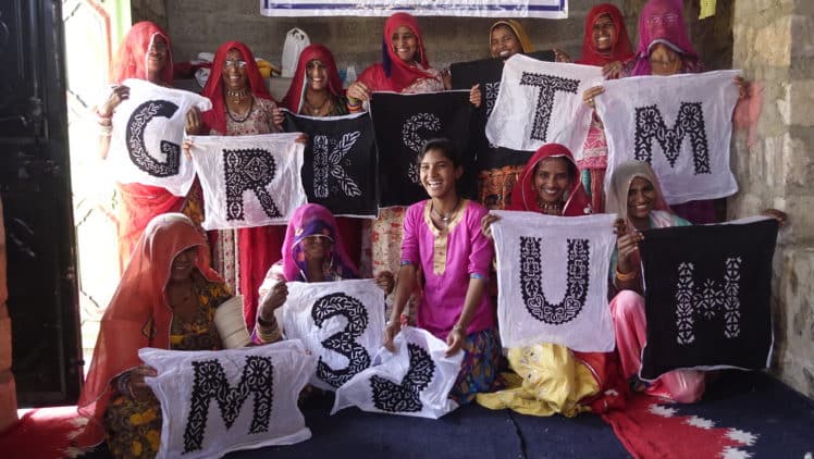
Our impact in terms of the number of craftswomen we work with has grown significantly — from just one for our first project to about 20 craftswomen in our latest workshop in Barmer applique.
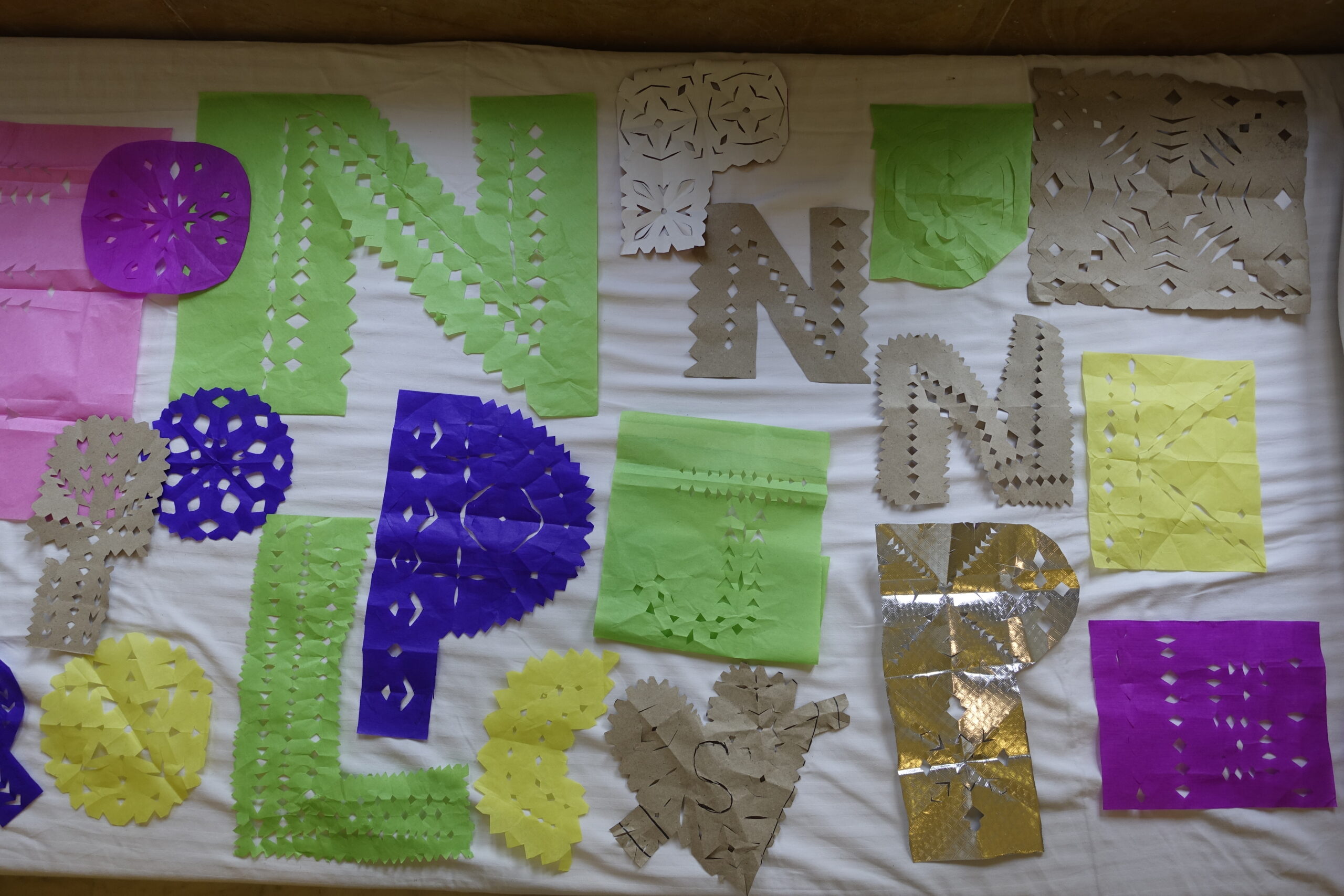
Design methodology workshops with craftswomen begin with the use of simple tools to explore letter forms and individual expression
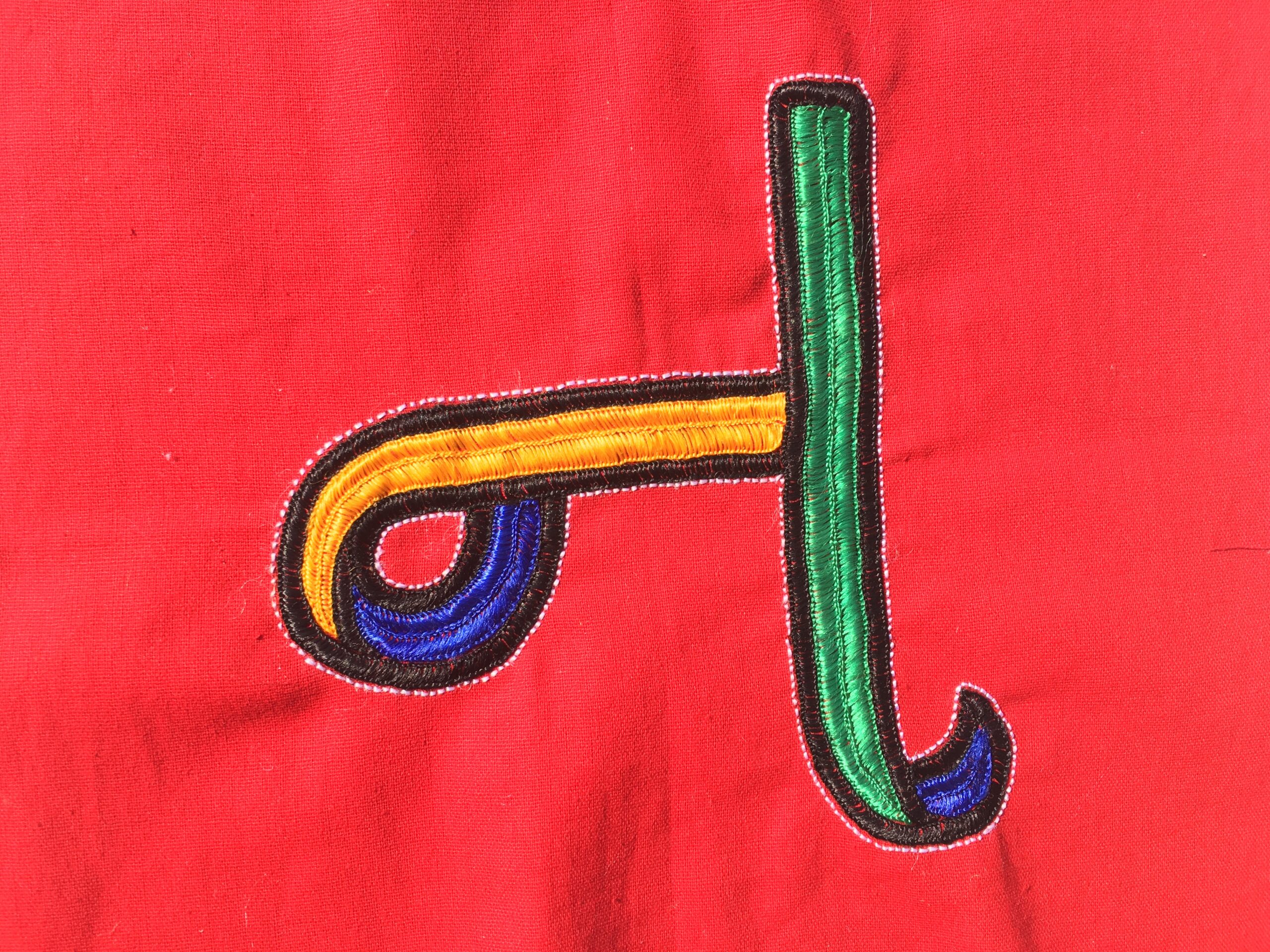
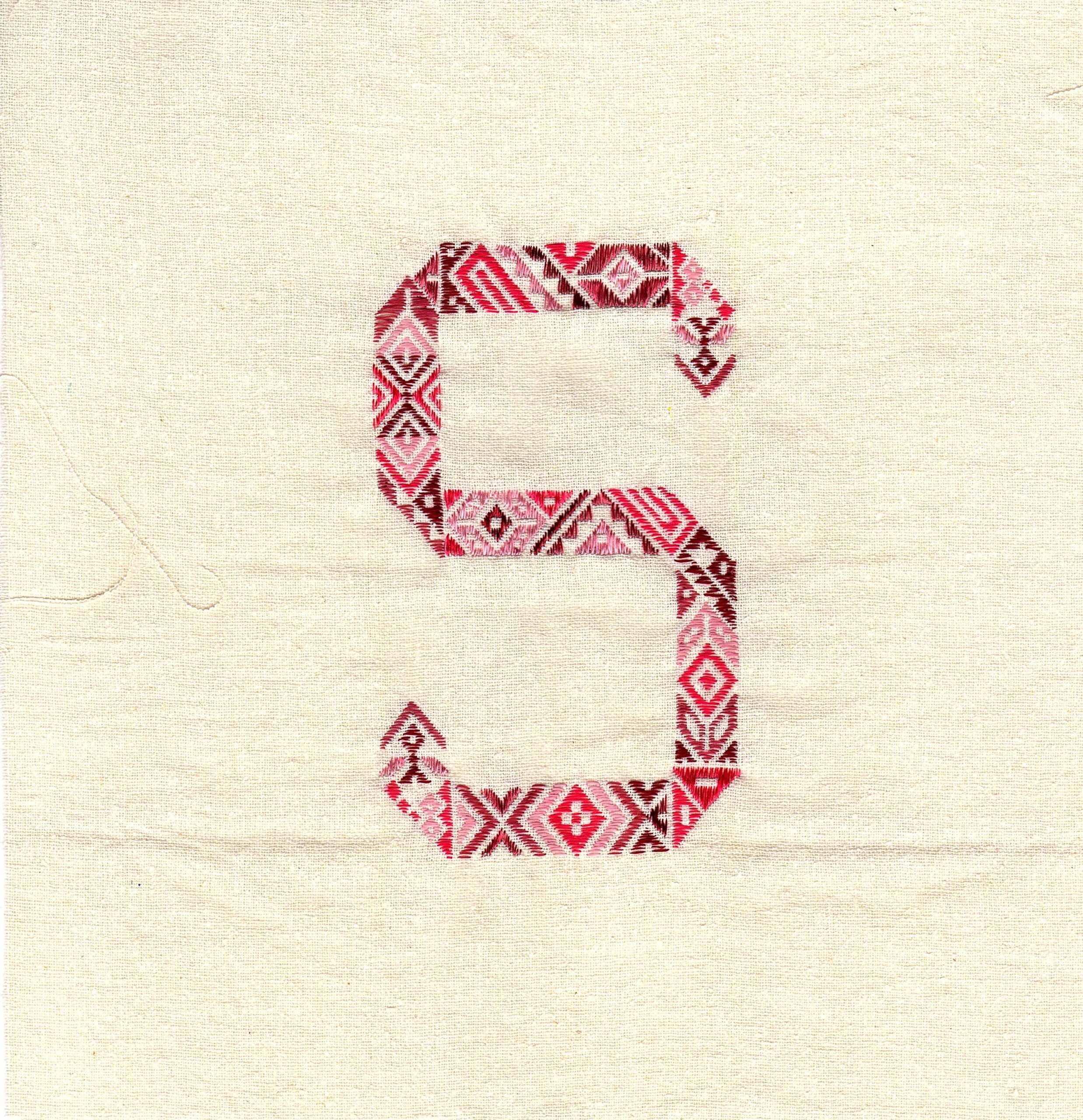
We also feel that our workshops are more focussed on making an impact in terms of the design methodology training we involve craftspeople with. The workshops are not only about the construction of letters from a craft but about how to inspire artisans to think differently about their craft and to encourage them to have a stronger individual voice in their craft.
We also learn a tremendous amount from the craftspeople — from the process of the craft, how and why it is made, when it is used if ritual in form and what is its connection to the community and the outside world.
Additionally, we also conduct hands-on with design students who use their design knowledge to learn about a craft, a community as well as how the craft is constructed. Using simple tools just like the craftspeople — usually paper and scissors, they have to figure out how to maintain the true lexicon of the craft while converting it into a letterform.
In this manner, both the craftspeople and design students are benefitting from the knowledge of each other and both are appreciating the value of each other. This, we hope will lead to more exchange between craftspersons and designers in the future.
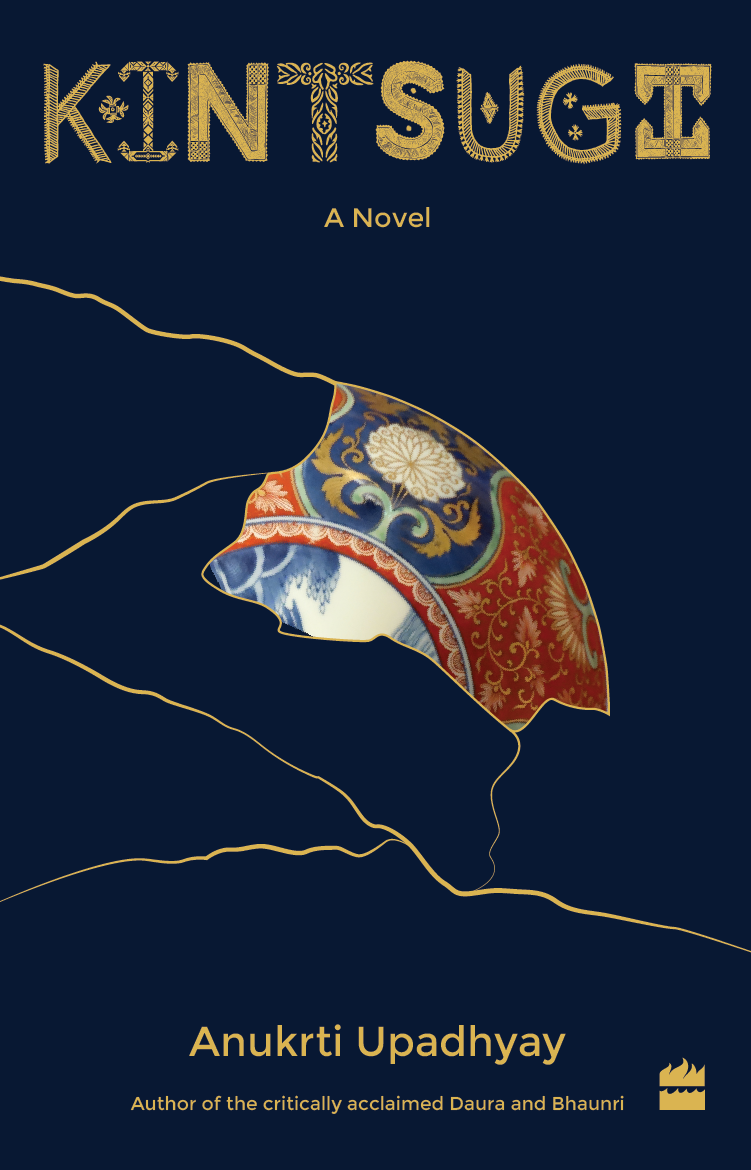 Global
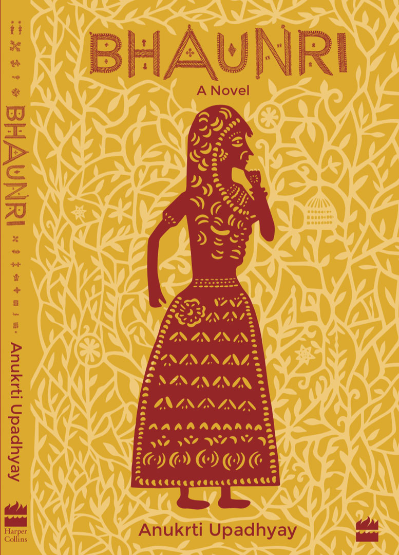
Response to Typecraft
There has been a keen interest in the Initiative internationally. The Typecraft Initiative has been showcased in several prestigious venues such as the recently concluded exhibition Atelier Muji Ginza in Tokyo. Previously, it has been exhibited at the Fukuoka Asian Art Museum and the London Design Festival. I have also had the opportunity to talk about the initiative at Typo Berlin, a conference on typography and type design.
Our customers are from across the world — from Chile to New Zealand, and from Australia to Canada.
The Typecraft Initiative has been covered by various media both in India and abroad, it has been published in a variety of journals and books such as India Contemporary Design by the V&A.
Funding and Support
We have been fortunate to get in-kind donations and commissions from various small and large corporations and NGOs. We are especially indebted to Synergy Consulting Inc., a US-based energy consulting firm run by Swati and Aman Sachdeva, who have been giving donations for one typeface per year since 2018. They have recently pledged support for 2020–21 as well.
Future Goals: Typecraft as a Tool for Literacy
Despite all of this. typefaces are still considered very niche and not everyone thinks to or knows that one buys typefaces. We are also looking at bringing Typecraft fonts into primary education and adult literacy as a way to create greater impact — as the audience base for education will be far greater than the current audience purchasing typefaces.
This makes sense as the letters are loaded with local mythologies and meaning which helps to not only decolonize and localize but also humanize our education. It also makes the learning of a language through a combination of images embedded in words less daunting and more experiential.
We hope to implement this in a couple of ways: Firstly, through the creation of type-kits that can use physical letters of the script rendered in some way by these women — which can be used to teach the alphabet to their children but also sold in schools throughout the country
Secondly, the digital version of the typeface can be promoted for purchase and use by schools, colleges, and the state government for use on official signage. In this way, a short-term investment can lead to a product that can be sold to a large audience on a longer-term basis.
For all this to be realized, we need governmental, educational and corporate funding and mentorship.
These are artisans who have centuries of trade and skill behind them. Yet they are struggling. How are you getting them to think differently about their art?
I would not like to club all craftspeople as “struggling, or helpless” as that is a very colonialist viewpoint that emphasizes that craftspeople have no agency (Spivak). We need to value craftspeople as equal partners in this process, and also, importantly, as people from whom designers learn a lot from — and often take more than give back. The syncretism found in our typefaces are a result of the embedding of the nuanced localized flavor and the rich heritage of craftsmanship into the letters. The latter would be flat and meaningless, lack cultural context without this richness and vibrancy of the handmade.
A key ingredient in the making of a Typecraft font is the craft workshop. The workshops, which are a space where craftsperson and designer can have a dialogue and exchange, is not just a place to make letters but more importantly, it is used to get craftspeople to think as independent authors if they already aren’t. It is also a space for us designers to be humbled by their skill and to use this time to understand local contexts, making process, use and meaning of the crafts.
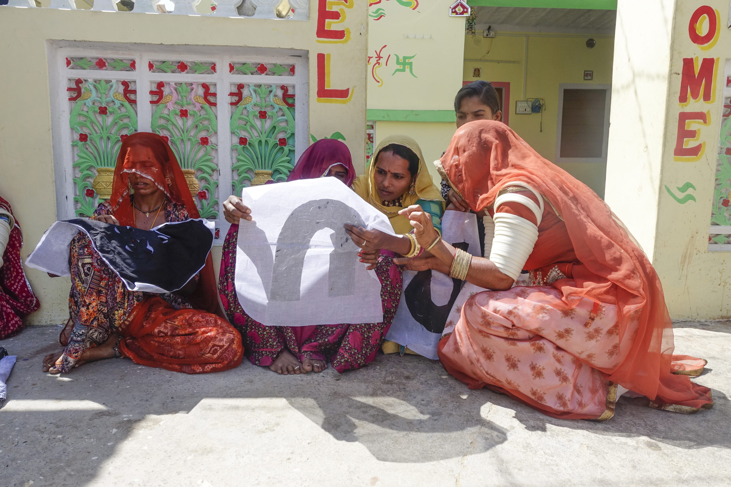
Typecraft Design Methodology Workshop
We start our workshops by explaining the purpose of our initiative and show some examples of the crafts we have worked with being transformed from their typical products and instead being made into letters and then into functional digital typefaces. These are shown to inspire craftspeople to start to think differently about their skills so that they can create new types of products that would be valued by paying customers.
For the workshops, we use simple and available materials such as paper and processes that match the craft. In the case of Barmer applique for instance, cutting paper was the most appropriate way to learn and explore forms. When we conducted the workshop, we found out that the craftswomen had never created forms and designs on their own — they were usually given the design and then asked to stitch it.
As a warm-up exercise, the craftswomen started to freely cut-up old newspapers — as a way to “sketch” and explore simple forms, initially and then with time more complex forms, and eventually in the course of the next couple of days, some of them graduated to making letters in the form of paper cuts. The presence of symmetry inherent in capitalized Latin letterforms makes them ideal for appliqué and paper-cuts. Some women made geometric cuts in the letters, but more skilled craftswomen like Nirmala could also make curved and non-geometric designs in the letters.
The Typecraft Initiative is a very small initiative with big dreams. Right now, we are largely self-funded; it runs only on grants and donations. Our goals are really to create something collaborative and something meaningful and of value and importance to us and hopefully to the crafts communities and the users of these typefaces. To build something that has legacy and inspires future generations.
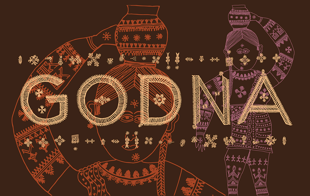
We also endeavour to get craftspeople to really value their own skills and to hope that they can think differently about their crafts once we see how their craft has been transformed into a digital communication device — a living tool — that is forever transformative and active. It is quite revelatory for many people — especially when they see their name written in Godna, a typeface made from arguably the oldest artform in India — the Gondi tattoos of Gondwanaland whose motifs are even found on the ancient Bhimbetka cave.
What are the design elements in these typefaces? Could you illustrate with two arts?
The craftspeople and folk artists we work with are our co-creators of all the Typecraft display typefaces. The fonts are loaded with cultural symbolism and meaning based on local contexts, rituals and belief systems.
The design elements in the fonts are not just the original* shapes and motifs of the cultural iconography embedded by the craftsperson, but also the outer container that these forms reside in. The outer forms of the letter determine legibility and comprehensibility of the letter — it tells the reader what to read each glyph as. While we are involved in guiding the construction of the entire letterform, the outer shapes are usually the domain of the designer. This is where we place certain constraints for craftspeople to work within. We take care to limit the constraints to only what is essential for legibility and letter-form consistency so as to not stifle creativity and freedom of expression.
The interior parts of the letters are the domain of the artisan — and is a place where the ornate detail and intricacy of the craft can have room to blossom. Depending on the craft, the inside and outside sometimes do intersect more than at other instances — such is the case in the Godna and Rabari typefaces.
The Godna symbol for bicchu (scorpion) which is believed to be tattooed on the skin to prevent a scorpion bite — is co-incidentally rendered in the letter “S” of the typeface. The fact that the godharin women are illiterate makes this even more remarkable. We also didn’t direct them to use certain tattoo icons in different letters, that was completely their choice. Here, the original shape is the scorpion motif and the container is the form of the S.
In the case of Barmer applique, the myriad forms of foliage (something that’s ironic to see in a desert-based craft) are also found in the letterforms made from that craft. Here the design elements include not only the shapes of the plant motifs within the letters, but also how those motifs interact and together impact outer forms of the letter. Since the number of visual elements are fewer in this font compared to Godna or Rabari, small changes in the inner motifs will impact the outer shape.
*original: refers to the shapes and motifs found in the craft itself.
Typecraft Barmer applique
Who are your partners in this initiative? What do they say about their experience in work on this project
Andreu Balius and Sol Matas — both type designers are partners of Typecraft.
Based in Barcelona, Andreu owns a type foundry called Type Republic. He has a PhD. in Design and also teaches type design at EINA Design University. He has a passion for sharing experiences with people from different cultures through the Typecraft experience and believes strongly that he can help make a small difference in the lives of the craftspeople and also learn from their skills and values.
“I believe type design is a way to make cultures visible to new audiences who were perhaps not aware of their rich crafts. The Typecraft Initiative is not just about making fonts — but it is about making human connections. It is about sharing one’s knowledge of design with craftspeople, but in equal measure, learning from the skills, culture and experiences of these craft communities. It is also about being aware of other ways of working, living and sharing,” says Andreu.
Sol Matas is a Berlin based, Argentinian type designer. She has her own type design studio — SolMatas.com — and has designed numerous typefaces including Kadwa in the Devanagari script.
“I have great admiration for what Ishan has achieved with The Typecraft Initiative. I find these workshops a great idea because you can see the enthusiasm and motivation of the women in drawing letters, whether in Latin or in Indic scripts, and exploring the forms while they are shaping them with a variety of techniques.
It is a rare opportunity as type designer to participate in this exchange. Most of the time, my daily work often begins and ends in the digital environment, which is why this experience of designing a typeface based on all these textures, experimental shapes and colours is very enriching for me. Working on the Paakko Gujarati script typeface, I enjoy the cultural context and sensitivity as well as the tactile nature of the letters. It connects different perspectives and cultures. It is rich and beautiful,” says Sol.
Hetal Ben and Mother Paani Ben at the Design Methodology Workshop
Could you share a few anecdotes working with artisans on this initiative.
There are numerous anecdotes with the craftswomen that I have had. Some of the ones that stand out include my meeting with Sajnu ben, a Dhebaria Rabari craftsperson, with whom I was working on a logo design project using craft. She wanted to know why I was making the logo in English and what it meant for her craft to be made into a letter. Those were early days of my interaction with craftspeople and I didn’t have any answer except that using English, would mean people from around the world could read the logo and learn about the Dhebaria Rabari embroidery. Sajnu ben wasn’t initially convinced, however, two weeks later once she finished the embroidery, she said that this was an interesting and unusual project for her as the forms were totally new and difficult for her to work on, and that she appreciated the challenge!
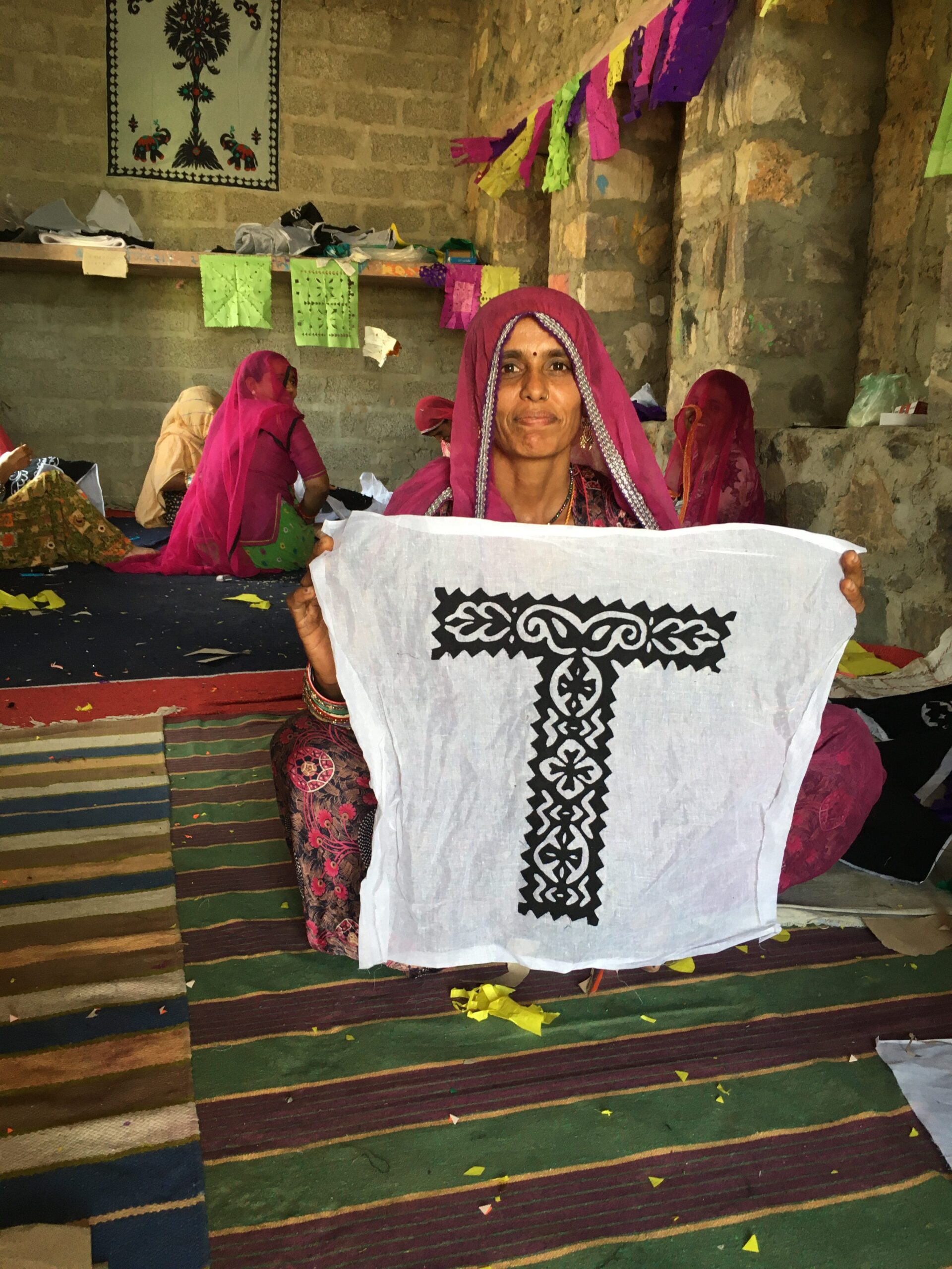
Bhaami Devi holding the T in Barmer Patchwork
When working on the Barmer applique, where we involved all the craftswomen to design their own letters using paper-cuts, we noticed that one of their daughters was of school age but not going to school (perhaps due to monetary reasons). But seeing everyone cutting letters, she also joined in, and having had some education could even recognize the letters — as did some of the other women after a few days into the workshop. A couple of days later, we were excited with joy to see her, when she came home dressed in the school uniform! Apparently, the parents decided that it was important to send their daughter to school after all!
Another anecdote relates to my meeting with Ram Keli in her village of Jamgala in Chhattisgarh, where I met her a few years after the creation of the digital typeface. Although Ram Keli can not read or write, she was amazed to see the letters that she and her family had painted a few years before come to life in a new avatar. Her son, literate in English, seemed to enjoy this the most.
After a couple of days of working with the Sodha Rajput craftswomen from Kutch, I was told that I couldn’t be with them the entire time during the workshop due to Rajpur customs which forbade men from being near married women. This posed a big challenge, as it meant that I couldn’t give feedback or look at their work while they were making it. Fortunately, I was travelling with Charvi, an intern at my studio, who as a woman could continue the workshop with the women. Since then, I always ensure that there’s at least one woman in our group during a workshop.
